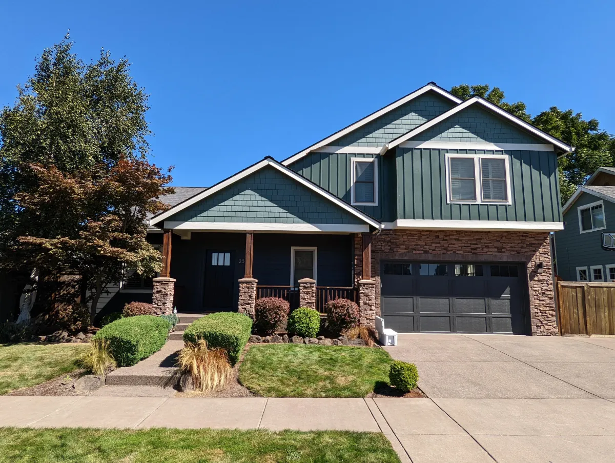
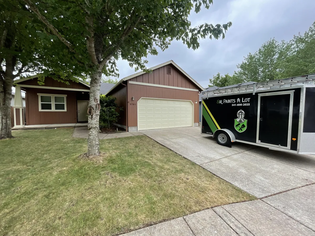
Your Reliable Choice for Quality Painting.
100% Satisfaction Guaranteed!
⭐⭐⭐⭐⭐ 4.8 / 5 | More Than 30 Video Testimonials

A New Standard In Painting
5 t0 9 Year Warranties
You need not worry about the longevity of your paint job. Our interior and exterior warranties are virtually unheard of in the painting industry. Most companies offer a 2-5 year warranty.
Guaranteed Satisfaction
Don't be afraid that you won't be happy with the finish you will receive from Sir Paints A Lot. We guarantee you will be 100% satisfied with our craftsmanship.
FREE Annual Touch Ups
Life's messy. Your paint doesn't have to be. Free annual, no-blame touch-ups included
( up to 60 Minutes per year with no labor cost)
Long Lasting Paint Jobs
When you hire us, you're making an investment. We believe that your investment should last as long as possible. We stand by our work, that's why we offer warranties up to 9 years.
We offer 5, 7, and 9 year warranties
FREE yearly touch ups on all jobs
We only use the highest quality paints and finishes
Process Makes Perfect
Rest assured that your painting project will be done correctly, without cutting corners or taking shortcuts. Here is our general process for painting projects:
Power washing (exteriors)
Scraping / Sanding (where needed)
Small repairs
Priming
Caulking
Painting (2 coats)
Clean up
Touch up
What People Are Saying
Jim T.
⭐⭐⭐⭐⭐
Great service, great staff. From scheduling to work on our home, everything was top notch. The team that came for the annual touch-up to our exterior paint found water damage--this allowed us to get this treated by a professional before major damage was done.
Scott W.
⭐⭐⭐⭐⭐
This is by far the best paint company in the area. Shawn and his crew are punctual, professional and always courteous. Their touch up service included is a very nice touch and was easy to set up. Will never use another paint company!
Tracy J.
⭐⭐⭐⭐⭐
Very happy with our exterior paint project. Received a bonus interior area painted. They use quality paint, and there was no work evidence left behind. They are very thorough. They stand by their work, and each year provide complimentary touch up's. I would definitely use them again!
Book An Estimate
Frequently Asked Questions
What needs to be done to prep for painting?
The customer's responsibility is to remove personal effects and make sure that other services or systems, like sprinklers, are not active during the project. Any damage that you know of should be brought to our attention so that the repair can be planned. Finally, we need space. Please remove all items from the work area before the job begins. This includes photos, knick-knacks, furniture, appliances, etc.
Does the painter fix holes?
Painters do fix holes but that’s not the most important part of the question. This is location specific. If the hole is on the outside of the house we need to know where it is, on what surface it is, and what is at risk. Some holes can be filled with wood filler and some cannot. Moving inside, our painters have a motto for filling holes on walls and trim, “If the hole is empty we fill it.” Meaning that if you want the picture to go back up you better leave the nail in or tell us specifically that you want that hole because by golly we’re gonna fill it.
Do they remove the old caulk before applying the new caulking?
This isn’t always necessary but we will definitely do it under two circumstances. 1. You want us to remove all of the old caulking or 2. We feel that all of the old caulking must be removed. Normally, the removal of caulking is determined by the type of failure. If the caulk is simply cracked in the middle, new caulking can be used to fill the crack. If the caulk's adhesion has failed, the old caulk is cut away and new caulk is applied.
Can we be home during the painting project?
Most of the time, Yes. For exterior painting, there are very few situations in which you would need to vacate your home. That being said, we have many homeowners leave just for fun. Like their own personal HGTV experience.
However, when you are having your interior painted, there are many more scenarios that would cause you to want to leave the house. Painting is complex and you will likely lose access to parts of your home for the duration of the project.
What is the process working with you?
Book an estimate
Read the confirmation email
We perform an estimate and provide you a bid within the hour (90% of the time)
You accept the bid
You pay a 30% deposit
We schedule the project and a color consult
Pressure washing (for exteriors)
We do the project
Receive annual touch ups around March each year
What to do when I have concerns or questions?
The first thing you need to know is that we want successful outcomes for everyone.
Prior to the job starting, we are available via call, text, or email to answer all of your questions.
Once the job has started we recommend questions first get brought to the crew lead onsite, they can handle almost anything. Questions about color, what is included, can I add this, and so on.
If for any reason you aren't comfortable with that or you want more, we have the original 3 options. This is a very stark contrast to the average company that has 1 person that never answers that phone and sometimes calls back.
How does the weather affect the painting schedule?
The weather plays a factor for sure and we try to plan around it but as you know every year is different. As a general practice, we schedule exteriors from the last week of April through the first week of October, only booking about 50% of our work outside for the first and last weeks of the time period.
We plan as well as we can to prevent changes in the schedule, and we try to call everyone a few weeks ahead to firm up dates just in case there have been delays.Ultimately we are at the weather's mercy.
Can my pets be home?
Yes and no… We love pets. The animals can be home so long as they can be separated from the project sufficiently. This is important because if we have to use iil based products, we can mask off the areas they are in and keep the fumes away from them. During the summer, We typically ask that they are kept inside or in a pen while we paint just so that we can be focused on doing our best work and not stepping on Fido. Don’t worry- if someone needs a potty break we can pause a minute.
What needs to be done before the pressure wash?
Pressure washing is like the worst storm, when the rain is coming in sideways and throwing the debris with it. We’ll clean up when we’re done but, until we finish, there is going to be some mess. Any wall hangings or plants that block the wall should be removed or pulled back so that we have clear access to the surface. Outdoor furniture that stays dry under a nice patio should be taken indoors.
Why is the house siding still bumpy and not smooth?
This is a common question we get when we cut off some peeling paint and sand the edges but don’t fully feather it out. Obviously, this question is situational but, for many situations sanding the edges perfectly smooth actually creates a flat spot that reflects light differently than the rest of the house causing the imperfection to stand out even more noticeably. Imagine a round piece of wood that had two unnatural dents. One dent was sanded out completely and the other was just roughed up around the edges. Ultimately, the answer as to which is right depends on your preference and we’ll defer to that but it has been our experience that most prefer the second option.

Copyright 2025 Sir Paints A Lot. All rights reserved. CCB# 245616. 2510 W 5th Ave #6, Eugene, OR 97402